This section allows you to view all posts made by this member. Note that you can only see posts made in areas you currently have access to.
Topics - Jack
Pages: [1]
1
« on: April 15, 2011, 11:39:46 am »
Hey guys, I thought some of you guys might be interested in this: Although the new 3ds Max 2012 Design version has got a lot of really nice pictures, I nearly came when watching the following video: [youtube:30tzkywo]http://www.youtube.com/watch?v=rL6sJA1BWAo[/youtube:30tzkywo] Especially the Peel-stuff will make unwrapping organic stuff soooooo much easier...or at least quicker 
2
« on: April 02, 2011, 12:26:41 pm »
Yesterday ArenaNet announced the new class of GW2: the commando. See for yourselves: http://www.guildwars2.com/en/the-game/professions/http://www.guildwars2.com/en/the-game/p ... /commando/In case they'll take it down (which will probably happen soon because -mark my words- where the commando stands there will be the "mesmer") I'll upload the screens here. My brother told me the skill videos where they showoff a few skills of the commando (  ) have been uploaded to youtube already.     [youtube:o15eyvwg]http://www.youtube.com/watch?v=m1tv9VpnwmY[/youtube:o15eyvwg]
3
« on: February 09, 2011, 11:00:53 am »
We've got even more colored names online now! :usad: [January 2011] I congratulate the following users on their achievements in this community and on the benefits that come with them. Contributors-gorq -Serifaz -SirFranc -TheBuG Advanced Artists-gorq -SirFranc For further information on how to achieve these ranks and what the bonuses are, read paragraphs 4.1 and 4.2 of the rules: faq.php#f3r0
4
« on: February 07, 2011, 01:41:57 pm »
Although this is a thorn that has been in my side a long time it has resurfaced recently as I tried to create a new armor (no recolor but actually one from scratch). Anyways, this thread isn't supposed to be a rant about how much I hate World of Warcraft but rather to inform the community about what restrictions they have to cope with or at least keep in mind when designing or actually drawing a new armor texture. Sadly I know of quite a lot of people in the scene that have never dealt much with other games and consider WoW to be the ultimate game in every respect, which it is not - by far, so I'm going to do a simple comparison with my favourite "Itz s0o mouch b3tTer!!11"-game Guild Wars 1... (Note: this is about the time Eluo will start vomiting when reading this post :ufu: ) BUt since he already knows it is you other readers that might be asking themselves now What's so bad about WoW armors?1. Badly stretched UV mapsDon't be afraid if you don't know what UV maps are, I will explain this a little bit and the pictures pretty much speak for themselves. UV maps combine a 3d mesh (model without texture) with a 2d graphic (the texture). The UV maps are sort of the "how the 2d graphic is wrapped around the 3d object" and also "which part of the texture goes on which part of the object". Since the Armors of WoW are a texture directly layed over the skin texture the UV mapping has a tremendous effect on the quality of the armor. Well at least if it's stretched like there were no tomorrow, which is the case in WoW. What does stretched mean? Those pictures will clarify that for you: The 2d graphic / texture is IN ALL CASES the same: a perfect B/W checkerboard, like this  Normally the texture is evenly distributed over the 3d model, which means that with the texture wrapped onto the model all squares should be about the same size (which means each part of the model has the same displayed resolution) and also there shouldn't be any stretching (squares should be squares even if they're rotated a bit, not anything else) as you can see in this screenshot:  (If you looked very closely you can actually see a little bit of stretching on the back side of her upper left arm, directly next to her shoulder there are rectangles not squares!) Now this wouldn't be a thread about WoW modding without WoW, so how are the UV maps of WoW models then? 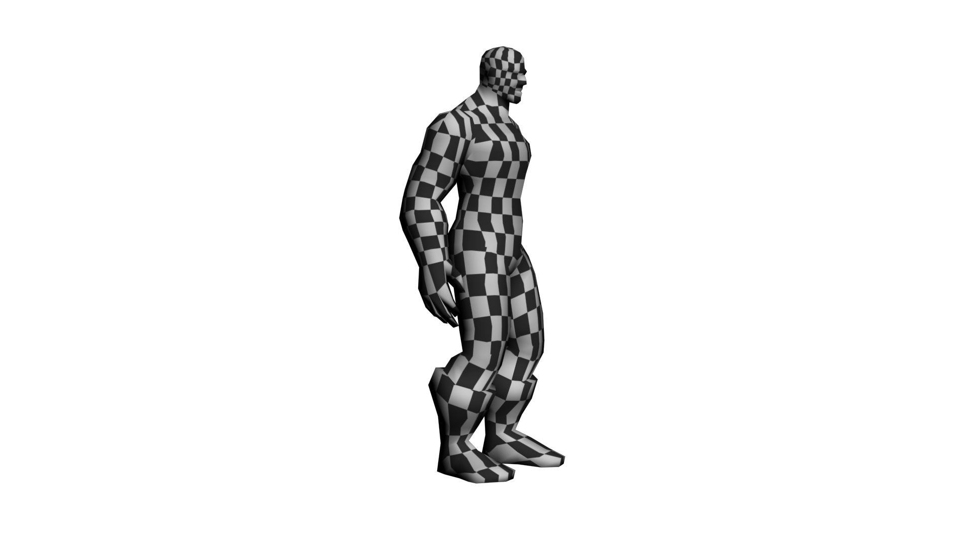 Now I didn't change anything about the model or UV maps here, I simply exported the model with Modelviewer, loaded it in 3dsMax and assigned a new texture (the checkerboard) to it. There is heavy stretching all over that model. The fact that the head has got a higher resolution compared to the rest of the body doesn't say that much, it's pretty obvious why that is. Anyways...STRETCHING!! Now if you don't really have Photoshop CS3+ extended or BodyPaint 3d or anything similar (and thus aren't able to paint on models directly) you'd have to paint on the texture instead and then try producing even something crappy like this: 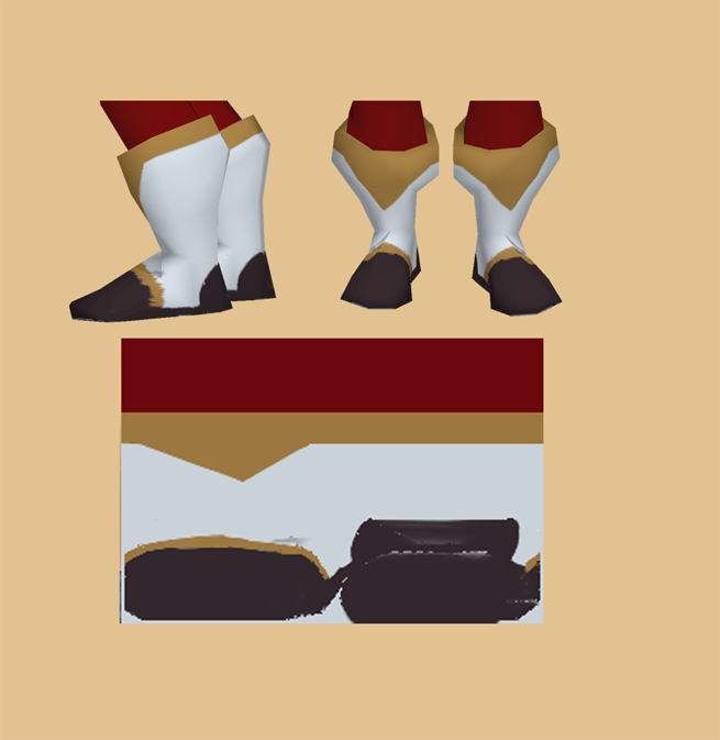 Especially note the golden ring on the model and then take a good look where it's situated on the texture. Also, the little black stripe on the side of the boots...it's diagonal on the texture, whereas back and front of the boot are somewhat aligned horizontally. For those still asking yourself how bad the UV stretching on WoW models is simply try adding a nice tribal tattoo on the model using only the texture file. To illustrate this even further I added captions and a bike on the texture and also saved you a screenshot of how it looks on the model afterwards (Take a careful look at how the bike on the arm resembles more crop circles than a bike and also at the size of the "str" compared to the rest in the word "lolstretching") 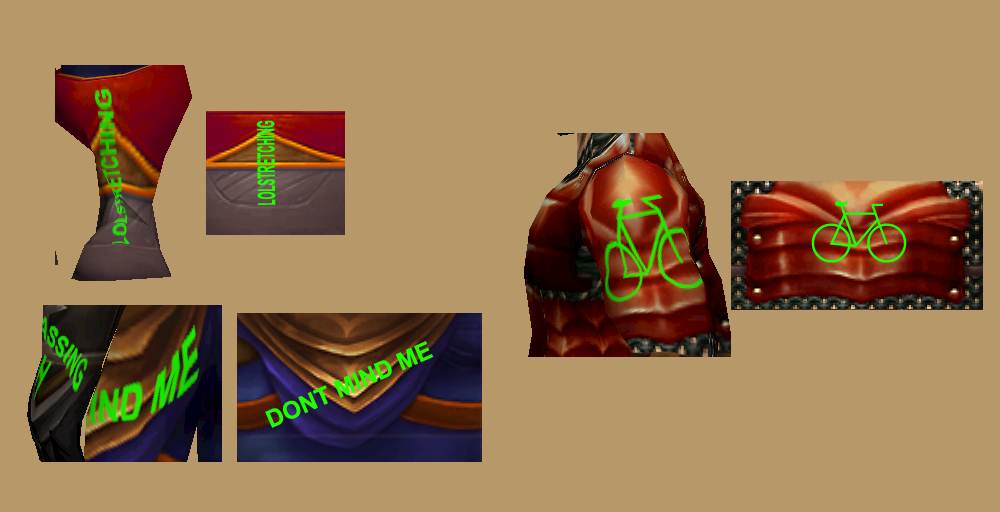
5
« on: November 20, 2010, 07:23:40 pm »
[youtube:194tlgrx]http://www.youtube.com/watch?v=x30Ghe_SdTA[/youtube:194tlgrx]
...best because it's the only true one
6
« on: September 12, 2010, 09:17:49 am »
Now about 3 years ago, Guild Wars 2 was announced and as a giant fan of Guild Wars 1 I was a bit dissapointed at first because from what they said back then it sounded like just another boring MMORPG like WoW, but after following the development a bit it's actually nothing like that. The following teaser trailer was released over 1 year ago, Cataclysm was (only) announced 7 months ago so keep that in mind  [youtube:2njy0bel]http://www.youtube.com/watch?v=FjCehYrEbO0[/youtube:2njy0bel] Even though the races shown (all existing in GW1 as well but only human playable), the ingame graphics (which are all hand painted like WoW :uparanoid: ) and all seems quite impressing already, check out their newest trailer where they also talk about the game design of GW2. It's definitly going to surprise a lot of people and I just so goddamn hope they implement it all. It sounds a bit like a mix of the fable series, WoW and fucking awesomeness :ugly: [youtube:2njy0bel]http://www.youtube.com/watch?v=CfCf9R0Phxw[/youtube:2njy0bel] Now, I'm definitly going to buy it (still no monthly fees, like GW1) and probably going for Charr ( http://wiki.guildwars2.com/wiki/Charr ), simply for their awesome walk animation and looks (seen in the first trailer, the Teaser trailer, at 2:22) or maybe Norn ( http://wiki.guildwars2.com/wiki/Norn ) So, I know of a few WoW players already who're going to quit WoW for GW2, because it's got thousand times better graphics, similar (if not better) gameplay, neater game design, giant lore as well (see GW1) and NO MONTHLY FEES. For those who have played GW1 and fear little RP in GW2 (although GW1 had more "playable story" than WoW ) here's something for you: http://www.guildwars2.com/en/the-game/p ... -overview/ (epic roleplay) One more thing: for those of you owning a copy of GW1 (with the latest expansion "Eye of the North") you better beef up your Hall of Monuments, because you're going to get bonusses for it in GW2
7
« on: September 11, 2010, 10:25:40 am »
Ever since the creation of this forum we have relied on a system of approval, where every thread and post in any of the "Tutorial" subforums had to be approved by a moderator or admin first. This is to prevent the forum being flooded by questions that have been asked already a few times, so the really vial information doesn't get lost in a heap of spam. It is quite some work for us to keep this up since every post in these subforums has to be approved by hand and although we might switch this system off once the forum has reached more popularity and activity (simply because it would be too much posts to handle) it will stay running for quite some while still. Having seen a few unapproved double posts where people just wrote barely the same stuff I decided to write this thread to remind people of this system, so they don't leave frustrated because their posts won't show. Within the rules there is a section for this system, but we forgot to clearly mention that posts are affected by the approval too, I apologize for this mishap and the rules have been changed to now state that posts/replies are affected as well. This mentioned section is 3.2. ( faq.php#f2r1 ) Although it is only In case you have any suggestions according to the approval system, leave your comments in this thread to ensure maximum usability of this forum. Update: Zax is currently working on changing the system so it affects new thread posts only and no replies.
8
« on: July 02, 2010, 04:08:17 pm »
Actually I pretty much hate these WIP threads but now I'm gonna do one. My first [WIP] thread ever, but the subject definitly deserves it. Maybe some of you guys know this monster as a Magic the Gathering card (of the same name), and that's pretty much because I think most MtG artwork and ideas are awesome and try to model them from time to time. This is the first npc/character model I've ever done off a MtG card, the other models were mostly architecture or items. Actually, this is my first monster model ever and it might still fail since I suck at texturing, but Eluo wanted to try doing the texture anyways, so here it is, the Frenetic Raptor: 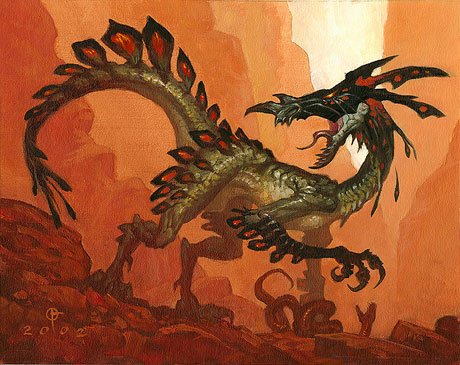  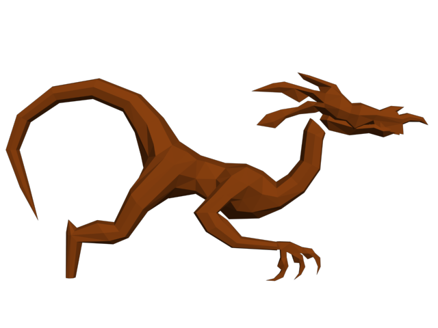 That's about where I am right now as I'm posting this thread. About 3-4 hours of work, at least there's only the feet to go and then I can go ahead an unwrap.
9
« on: May 14, 2010, 11:12:07 pm »
Difficulty: IntermediateTools used:-Photoshop CS 1. The ProblemI bet this is something everybody has already experienced: you come across some graphical stuff and you immediatly think "some noob did this, it looks totally unreal", but you could never describe what it really is that gives you the expression, or at least it takes a lot of experience to be able to tell. So here's to all of those creating architectural textures with the just described effect (the good message is: if you realize it's looking bad, that's the first step to improving it!). I'll be giving you a sort of checklist together with an example on which you'll be able to see the effect. I'm starting off with a pretty basic texture, quite "noobish" in appearance. It's already seamlessly tileable and color corrected, but it looks pretty dull and unreal, although it's a realistic wall texture combined with wooden texture. 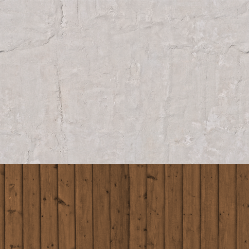 2. Add Detail2.1. Different Structures 2. Add Detail2.1. Different StructuresNow I've done the first step on this thing already: instead of having a simple white wall I added a wooden structure. Now even if you wanted a simple stone wall for let's say a temple, you could still add different stone structures, like seen here, with the different shades of grey resembling different stone structures, and the A and B standing for some kind of graphical element or hyroglyphic text. 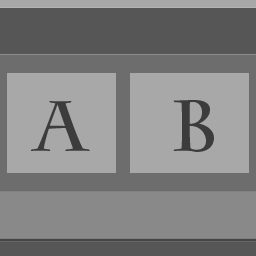 Of course the whole texture should still make sense in an overall architectural context. Concerning the example I'll add some more structures to it, three bars to be exact. One on the top of the image, one on the bottom and one on top of the seam between the wall texture and the wood. Those bars are going to be made of wood too. 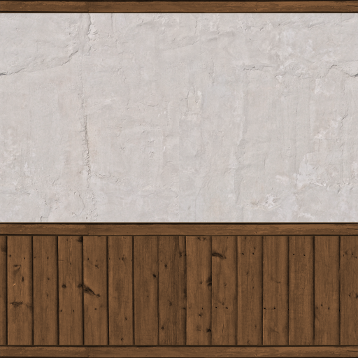 Looking a lot better already, right? 2.2. Plants/Organic StructuresOften plants like ivy, moss or tendrillars can be found on old walls, roofs, floors...this adds a little "old" and "overgrowen" feeling to your texture, but also a kind of realism - the thing we're heading for. Now although it won't make much sense adding it to my interior wall, I'm pretty sure you can recall having seen moss on roofs, some ivy vines on exterior walls etc. Don't forget it when doing exterior stuff, but rather do it as a modification of your basic tile. 3. Light and ShadowInstead of having thousands of different maps for one texture like you're able to have in movie models, in game modelling the light and shadow information has to be rendered into the diffuse map (the diffuse map is practically equivalent to "texture" in the WoW engine, as it's being the the only texture map). 3.1. BevelBevelling your layers is the first step on adding depth information to your 2d graphic. It enables you to create somewhat realistic shadows on structures sticking out. In my case it's the wooden stuff I'm going to add some bevels to. 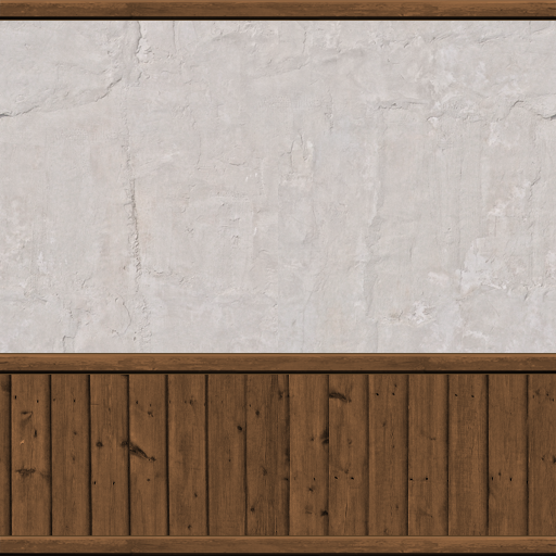 It's not a groundbreaking effect, but it's definitly something your eye will either recognize or miss ingame. 3.2. ShadowsUsing the Outer Glow and Drop Shadow (or even Emboss Bevels) you're able to create some nice shadow effects with just a few clicks, just keep in mind where the light source is coming from! (most of the time it's going to be the sun, so the angles are most of the time 90° in PS) On my interior wall the shadows will be thrown from the bars onto the wall and wood, although the one on timber won't be as "big" as the one on the white wall, because it doesn't have such abig difference in height to the bars. Here's the result: 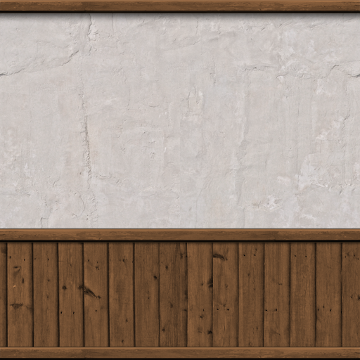 3.3. Gradient Overlays 3.3. Gradient OverlaysThe last thing when talking about shadows are the gradient overlays. Although they too are subtle, they'll make a huge difference in realism. When doing gradients keep in mind what color your lightsource is and where it's coming from. I often do gradients on both the several structures seperatly as well as one overall, just try to not too much brighten/darken your image, play with the opacity settings. 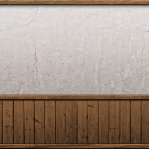 4. Dirt4.1. Dirten up the Pattern 4. Dirt4.1. Dirten up the PatternUsing simple Dirt Textures you'll be able to bring some diversity into your structures. The Dirt Textures should be of the same "family" though. Adding a rust texture to wood often doesn't look too good, but experiment! 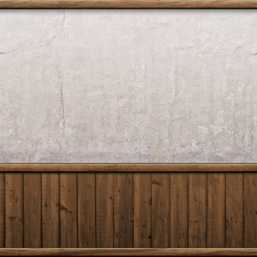 4.2. Cracks, Dots and Stains 4.2. Cracks, Dots and StainsNow here's where your custom brushes come in handy. I bet you all know where to get cracks and stains brushes. Simply brush in some custom dirt on parts where it makes sense (realistic-wise). The outcome can be pretty awesome, but I wanted to keep it pretty simple here: 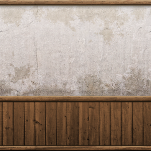 4.3. Used Edges etc. 4.3. Used Edges etc.This one's a bit tricky. You have to think of the parts of the texture that get used a lot and therefor will wear off eventually. This is pretty easily explained with edges: people will shrub along and the texture and color will change, that's what we're adding in by hand. You can either use brushes or simple strokes, depending on your texture. 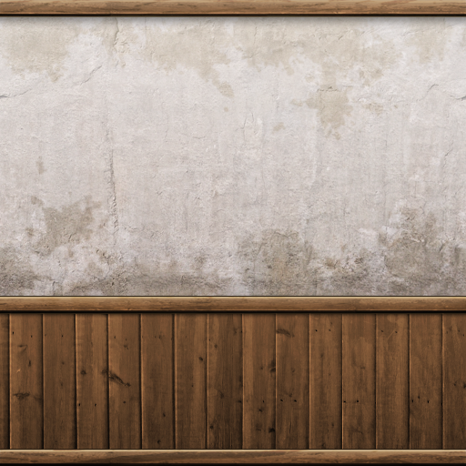 Very simple white 2px strokes, but it definitly adds something to the texture. 4.4. Accumulated Dirt - Water stains and dusty partsAsk yourself where dust or water would leave "dirt" over the years and in which way. In my case the wood near the floor will be rubbed off a little so it gets brighter. 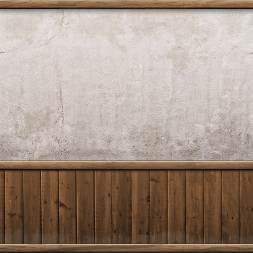 5. Final Touches and Sharpen 5. Final Touches and SharpenThis is my favorite part. I hope you kept all your stuff in nice layers because this is the time to fiddle around with your settings, try something out. Once you're done, hit CTRL+SHIFT+E to merge all layers to the background and sharpen your image - you're done! 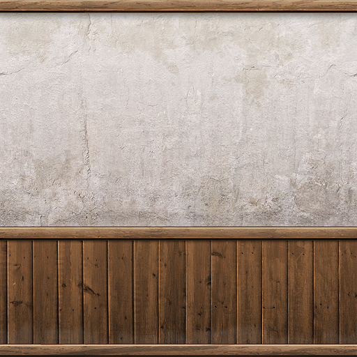
10
« on: February 21, 2010, 01:02:46 am »
Difficulty: BeginnerTools used:-Photoshop CS The first problem you'll stumble upon when creating textures is the lack of a texture blank library or collection. With a little effort and possibly cutting out some textures can be found in the internet, but you can be glad if they're shot from a 90° angle and with the right perspective. Most textures won't have the same hue or saturation over the whole picture and most of them won't be tileable. In the following tutorial I'll teach you how to fix all three points, given the right resource. Here's the picture I'm starting with: 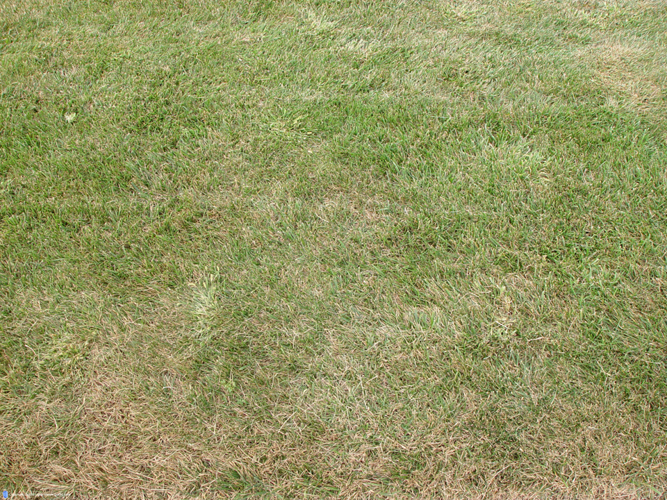 The perspective seems to be correct everywhere in the picture and no depth of field or any other blur occuring. However there are four things we need to change in order to be able to use it as a tileable grass texture (or blank): -Incorrect proportions (and size) -Hue not equally distributed -Saturation also not equally distributed -Not seamless Maybe you'll ask yourself why just scaling it down and making it seamless will do the work. Well, looking at the picture right now you won't notice anything weird. That's because your eye is automatically calculating light sources etc and even the fact that all blades of grass look different. So even though one is green, one is brown and another one is a darker green, inside a whole lot of them they all appear the same color. Once the whole picture is tiled several times next to each other and then zoomed out a little (as it would be inside a game) your eye will be making out patterns of brown grass inside the green grass and will then automatically notice the same pattern on the other patches as well, making the grass texture seam unrealistic. In order to prevent this, structure, hue and color should be somewhat equally distributed all over the texture. Fixing the proportions is a pretty easy thing, but I still have some tipps for you. First of all copy the whole picture you have, create a new 512x512 or whatever picture and paste the image into it. Using the transformation tool (shortcut: "ctrl+t") you can scale it down so it fits the whole image. Try keeping the proportions (percent of stretching) equal or near equal and don't scale it down too much. Always keep the relation to the player character in mind. Blades of grass as big as half the leg seem very unrealistic, at least as ground texture (not as model though). Too small will be bad either. After this, your image is probably a bit too soft and blurred. You could either transform it down bit by bit (no more than 10% reduction per step), which means ctrl+t, both values 90%, accept transformation, ctrl+t, 90%, accept etc. or you could use sharpen mask and play with the values a little. I can recommend using both techniques simultaneously. Now press "ctrl+a" to select everything on the canvas, "ctrl+c" to copy that part and "ctrl+v" to paste it onto a new layer. Delete the lower layer (where you cut it out) afterwards. This way all the stuff not on your canvas (which is still there) will be deleted. We're going to move the image around later on so anything outside of the canvas would cause big trouble there. 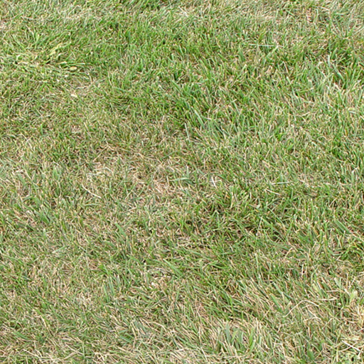 Remember what I said about the patterns? Tiling the above texture illustrates that pretty well: 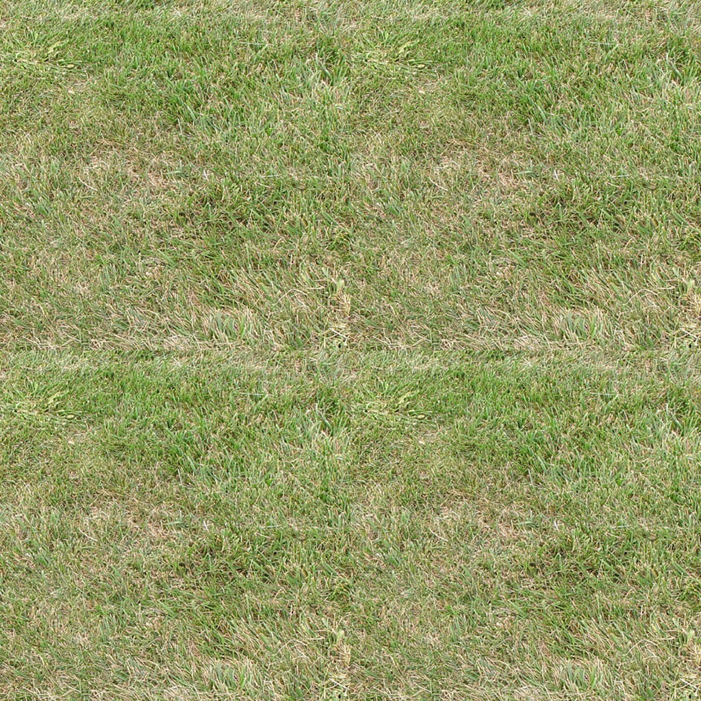 [Note: Any operations done to the structure of your texture, like editing small flowers into the grass, adding patches of snow via clouds etc. should be done BEFORE the next step or they will cause new seams. Remember this guys, or your work will be useless afterwards!] Now go to "Filter -> Other -> Offset" and enter a value equal to half the lenght and width of your image into the corresponding field. After hitting okay you'll be able to have a look at the way the texture would tile ingame: 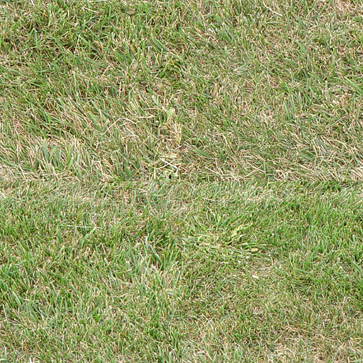 It looks horrible, but we can change that with the clone tool. All you have to do is copy parts of the image and paint them over the seams. Here are some tips on that: -Be careful not to hit the borders of the image, as you will most likely create new seams by doing so
-Don't just paint over the cross only, it'll be visible for the eye as it will look patched. Try moving inward from the cross as well.
-Use a brush that's not too small and not too big. As for 512x512 textures a soft edge 35 px brush seems pretty good for the job.
-Try eradicating different structures using this step. Don't copy both brown and green grass but either only green or only brown (not from the same part of the image all the time of course!!)
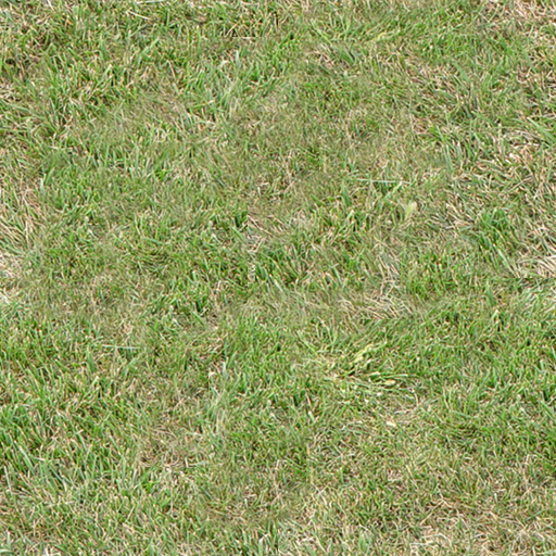 Now duplicate the layer with the texture on it and apply the High Pass filter ("Filter -> Other -> High Pass"). You have to play around with the settings a bit in order to find the perfect value where the structure of the texture is still visible but the brigthness and saturation is equally distributed all over the image. [Note: You can apply the High Pass filter a second time and even though you could not choose any lower value before without destroying the structure, applying the HP filter a second time with the same value helps you to go a little further still without doing any harm to the structure] Set the blending mode of this mostly grey upper layer (where you applied the HP filter) to "luminance" and you'll see that hue, saturation and brightness are now far better distributed all over the picture: 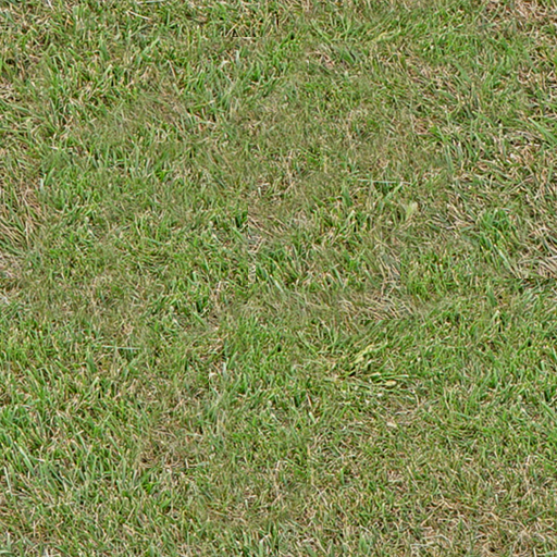 In this example the grass is a little too dark for it's purpose, I rather wanted a little brighter one like the one I started with. No worries there as we've still got adjustment layers! [Note: Adjustment Layers >>>>>>>>>>>>>>> simple adjustment! Don't use the latter one, ALWAYS use the layers! Go to "Layer -> New Adjustment Layer -> xxx"] As long as you're using either seamless or monocolor layer masks all adjustments won't do any harm to your texture. If you use clouds though or anything else, it will most likely create new seams when tiling it, keep that in mind. The layers I have now that the texture's finished: 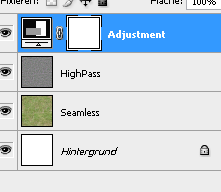 And here's the finished texture itself, compared to the "original" (down- and resized original) BEFORE: AFTER:  Tiled:  One more tipp I can give you is once finished, apply a sharpen filter ("Filters -> Sharpen -> Sharpen") and although it will look strange at first, the results ingame are pretty good. (This has to do with the way our eye reacts: you tend to perceive hard edges better than soft edges this applies to moving as well as to standing still, so while standing still those edges will look weird, but while moving they look perfectly normal while without the sharpen it'd look like one green blob. And to be honest, whos going to stand there and stare at plain grass for a long time inside an MMORPG?)
11
« on: February 20, 2010, 06:21:14 pm »
Difficulty:IntermediateTools used:-Photoshop CS 1. Conceptual thoughtsVery important when doing architectural textures is having a reference and/or a concept art you can relate to. I always tend do take realistic photos, maybe modify them a bit (like mixing two styles to create a new, unique one). The big problem you're going to have (especially as a beginner) is that in your imagination things will look totally cool but when realizing the texture and then wrapping it onto a model it will look totally dull and boring. Better stick to something already visualized and the chance it'll look bad are significantly lower. Now here's the reference I'll be having for this tutorial: 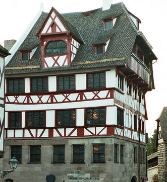 You might already see that in order to save space and filesize this house needs roughly 4 textures (going from ground floor to roof:) -Grey Bricks -White-Red Wall Variation 1 -White-Red Wall Variation 2 -Dark Blue Roof I'll be going for number 2, the White-Red Wall Variation 1. Now the next thing I do is create a palette with the main colors (using the eyedropper (shortcut: "i" in Photoshop) and the brush (shortcut: "b") and then create a rough outline of the alignment of the different elements of the texture. [Note: most of the time this already is part of what's going to be my final texture. The rough outline with the main colors is the first layer of the texture, already drawn on the picture with the final size] 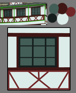 As soon as this is done I'll head for a quick analysis of the materials the texture consists of. In this case we're going to need one glass texture, one iron texture, one wood texture and one plaster-like texture. Several "dirt" textures add to this list but we'll come to that later on. [Note: You don't have to analyze the texture like I did, this is just to illustrate my lines of thought, this is the first time I did this not only in my head. Since it's not that hard to figure out which textures you'll need for which part of the final texture I'm sure you can do it in your mind as well!] 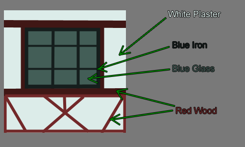 2. Gathering the resources 2. Gathering the resourcesIn order to get the texture going you'll need some blanks of course. It's always handy to have a big library of those at hand, but even if you don't have one (yet) you can always start growing one using the multiple sources of the internet. Here are some I can recommend to you: -Google for the blank you wish and add "texture" as a keyword. (easiest solution, sometimes crappy results though)
-Search http://www.flickr.com/ for a picture containing your element and create a seamless blank from it (needs some advanced photoshop skills) -Create one yourself (either using photoshop filters etc, multiple tutorials in the internet, most of the time ugly results or you could draw them by hand, that's what blizzard does - given the fact you can draw of course...I can't) -Buy one of the numerous texture packs out there. Most of them don't come as finished textures but texture blanks, sometimes seamlessly tiled, sometimes not. (Also very easy and timesaving, but most of these packs are pretty expensive) [/list] When selecting textures from your library there's one more thing you have to keep in mind: tiling. Think about the way your texture will be tiled on the final model. In this case the texture only will be tiled horizontally (left<->right), so we have to either choose textures which are able to be tiled horizontally or make them seamless ourselves. I'll be doing a tutorial on how to make textures tile seamlessly soon. Not all the textures reach the side borders on this one though - the glass and iron texture don't have to be tileable in any way.  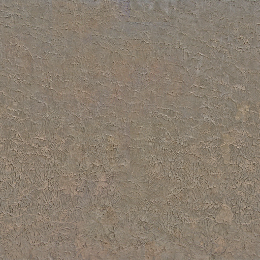   Some of these images aren't in their original state, I made the plaster texture tileable and the wood texture was made longer (not by stretching but by using the clone tool - photoshop shortcut "s"). The colors all aren't correct, but that's because we're just looking for suiting blanks right now. Images to add realistic structures to our colors. 3. Creating the textureWe got the references and we got the resources we need, so we can start working on the actual texture now. The first descision you're going to have to make is the size. Most of you already know to just use powers of 2 as sides - 128x128, 256x256 or also 64x128 etc as long as both are a power of 2. But which one is the most suiting? First choose the proportions, the reference might help you. In my example you can see that one texture is pretty much square, so the file's gonna be square too. A good general rule for the number of pixels per side is to adjust it according to the maximum size it will be taking on the screen later on: the more you'll be able to zoom in, walk closer etc, the bigger the sides should be. As for architectural textures 512x512 is the maximum you should go. I'm going for 512x512 as well as you'll still be able to size it down easier than to enlarge it afterwards. The following steps differ of course depending on your texture, so I'm only able to give you just some tipps on it: -Work with thousands of layers. Each element gets its own layer. Every "dirt" texture gets its own layer, every color layer is seperate etc. This gives you the most power over each small part and you're able to change things without ruining the whole texture.
-Don't delete parts of textures etc. Sometimes there's a little part missing too much and you'll regret it but can't go back that many steps. Use layer masks instead. That way you're able to crop image parts without deleting them.
-Use lots of "dirt" textures. You'll have to play around with them very much especially at the beginning. Once you've got the hang of it you'll already know which dirt texture'll fit most but there's only one general rule when starting: try it out and then try out some more.
-Use folders. Since you've got lots of layers you can pack them into folders, make several layers invisible/visible with just one click, move them all at once etc. Folders are very helpful if you put the right layers in them.
-Don't forget about Layer Style! You can use it to either create realistic Shadows (Drop Shadow, Outer Glow on Multiply with dark color) or even realistic bevel (if you set the options right) even if you can't draw realistic shadows etc.
Now here's what I did: 1. Texture LayoutUsing the concept graphic as a reference for proportions etc (by scaling it up to 512x512) I packed the image with the blanks, tansforming them into the right places. I cropped some parts, stretched, rotated them and played with the layer hirarchy. I also grouped the layers into the 5 colors: DarkRed (Wood), LightRed (Wood), DarkBlue (Iron), LightBlue (Window), White (Plaster) 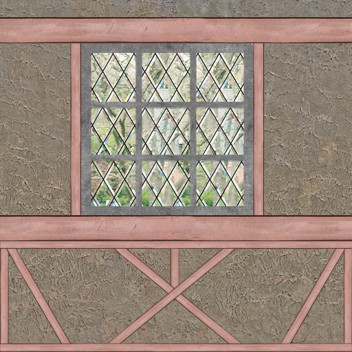 2. Dirt Textures 2. Dirt TexturesI copied all the elements inside a folder, hid the originals and merged the copies to one "master" layer. This master layer gives me room to play with settings and also saves time when I want to change a certain value. What's more by holding "ctrl" down while clicking on the image of the master layer inside the layer panel/tab I can select the not transparent values in order to create layer masks. 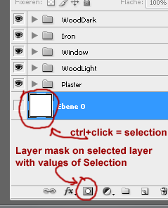 Now let me explain the term "dirt textures" to you...it's not a texture of dirt, close but not quite correct. You use dirt textures in order to roughen up a structure, make it seem more realistic (nothing's nice and clean, especially not architecture). Anything can be a dirt texture that looks worn. Sometimes dirt textures can be made by simple dirt brushes (black/white) or also using special colored textures. There's no real general rule about that but it's quite a good guideline to say try sticking to either realistic worn elements that exist in real life as well or use dirt textures of the same structure family as your structure texture (i.e. another wood texture as dirt on wooden parts) Something you've got to be aware of though: dirt textures can easily ruin your seams! Either choose seamless dirt textures when using real textures as dirt or stick to brushes (or create a seamless dirt texture yourself). 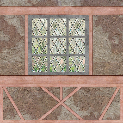 3. Coloring 3. ColoringWe start by selecting the master layers and hitting "ctrl+shift+u" to completely desaturate them. On top of the master layer I create new layers filled with the color corresponding to the element and set the blending mode to "color" (NOT "hue"!). Now the color palette from the beginning comes in handy. Cut it out and paste it into your texture, above all other layers. In order for the elements to really take the color chosen you have to create a brightness/contrast adjustment layer BETWEEN the color- and the master layer and play with both the brightness and contrast value until the right color is achieved. It's very useful to hide the other parts of the texture while color correcting one (just hide the folder, that's the easiest solution) Here's what it looks like with the dirt textures, one step further to completion: 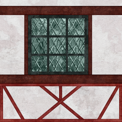 4. Shadows and the Rest 4. Shadows and the RestThe last thing to do is adding shadows and some finishing touches like cleaning up the picture, fixing mistakes, refining stuff. I can't tell you anything on those things except the shadows: -Use the master layer to add layer styles.
-In order to achieve different shadows on the same element, cut out parts of the master layer.
-Drop shadow is the most obvious tool to use, just be careful to deselect global light, since it'd affect shadows of other layers too
-Other very helpful layer styles are the Inner- and Outer Glow, set to a dark color and "Multiply" blending mode.  And it's finished!
12
« on: February 17, 2010, 04:51:08 pm »
MPQ/Patch BasicsDifficulty:BeginnersTools used:Prologue:The MPQ format is a simple archive format like .rar or .zip which most of you probably know. You pack multiple files in one big file. You'll find all of them in your WoW Installation directory, inside the "Data" folder. One could split the MPQs into two parts: the graphical MPQs storing most 3d (models) and 2d (textures) art and the functional MPQs which contain mostly GUI elements (scripts as well as the pictures used) and the Client Database files: DBC. The graphical MPQs are those directly inside your Data folder and the functional MPQs are located inside the subfolder corresponding to your language package, i.e. "deDE" "frFR" "enUS" "enGB" etc. Patches are MPQ archives where some files might overlap with files from other MPQs or "lower" patches. Always the file version of the highest patch is taken in this case. "Higher" and "Lower" referrs to the hirarchy of patches. it goes like this: 0->9 a->z where 0 is the lowest patch and z is the highest. Patch Hirarchy is stated in the patch name itself, so patches look like this: patch-a.MPQ, patch-8.MPQ, patch-k.MPQ It's always this format. Summary of MPQs:Below is a list of the most common MPQs and their content roughly summed up (there are exceptions to the content and by "common" I mean those containing data modified most of the time by modders): Graphical MPQs:CommonTexture files of the main game, without expansions Common-2Model files of the main game, without expansions ExpansionModel and texture files of the Burning Crusade Addon LichkingModel and texture files of the Wrath of the Lich King Addon Patch-x (Whereas "x" is either a number from 0-9 or a letter from a-z) Any additionally downloaded data, overwriting files from any of the previously mentioned MPQs Functional MPQs:Basically there is only one really important functional MPQ: locale-xxXXDBC files, XML/LUA GUI Scripts, GUI Elements (Buttons, Bars etc), Loading Screens Extraction of Data:Open MPQEditor and go to "File -> Open MPQ archive. Navigate to the WoW/Data folder and select your MPQ.  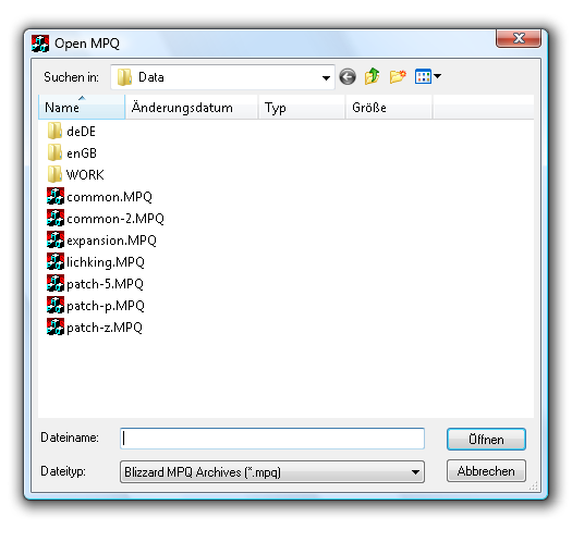 There might be a popup regarding a "listfile" just use autodetect and use the internal listfile and click OK. 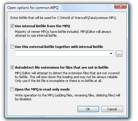 The data inside the MPQ will now be visible and you're able to navigate through the folders. Once you found the file(s) you want to unpack mark them and rightclick on them. Choose "Extract" or use the shortcut CTRL+E and the file(s) are being unpacked in your chosen location (together with their folder/subfolder structure inside the MPQ so you might have to click through some subfolders) 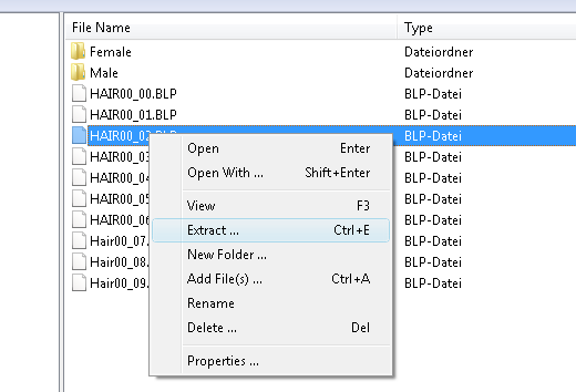 Packing of Data:Create a folder on your desktop (or anywhere else easy to access) and let it have the exactly same folder- and datastructure the patch will/should have. For example if you have modified HumanMale.m2 the modified .m2 should be located in Subfolders "CharacterHumanMaleHumanMale.m2" since this is the correct path for the m2 inside the patch.  Back in MPQEditor choose "File -> New MPQ archive". A popup will appear where you are able to define a name for your patch. 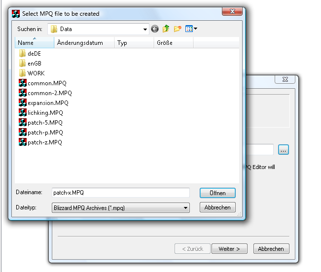 Remember the patch structure: patch-X.MPQ where X is a number from 0 to 9 or a letter from a to z. Also the .MPQ must be written in capital letters. You often have to do so by hand, as the standard is .mpq in minor letters. In the next window, choose to build the MPQ archive from a directory and choose the earlier created folder. Your patch will now be created automatically with all the folders and data you have inside the directory. 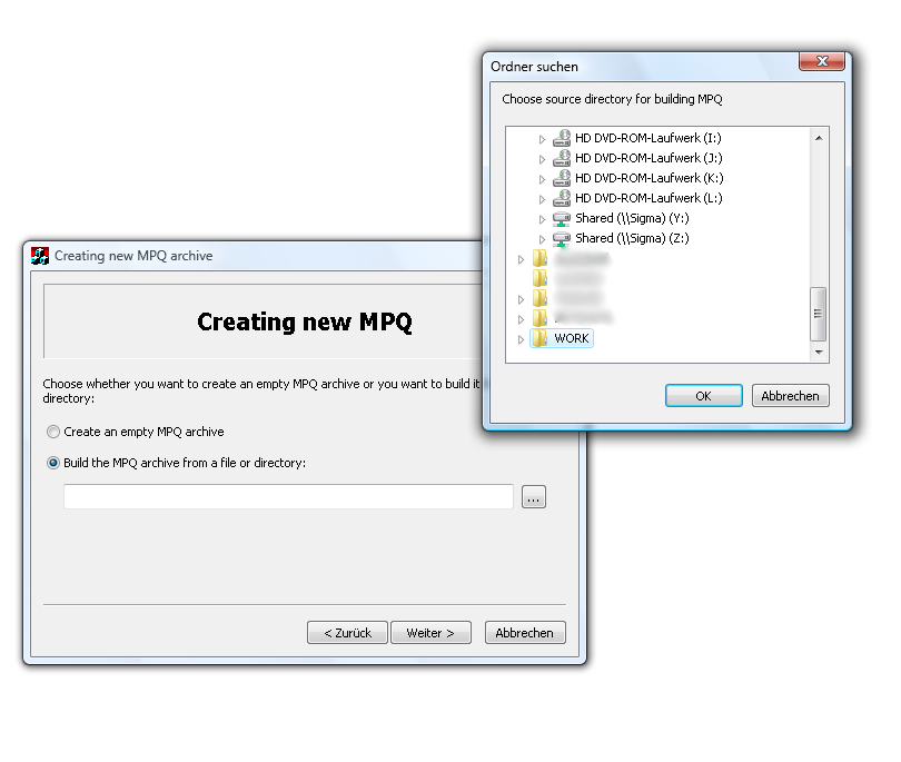 From the following windows choose the default options, like seen here: 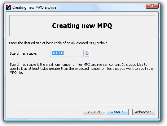 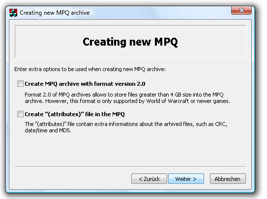 Once you're done you can create new folders or add new files to your MPQ by rightclicking somewhere and choosing the corresponding option. Biggest sources of mistakes:- NEVER open an MPQ with multiple programs simultaneously! This includes World of Warcraft as a program!
- Are you sure there's no "higher" patch overwriting the files you added as a patch?
- Make sure .MPQ is in capital letters. MPQEditor has .mpq as default, so you have to write ".MPQ" at the end of your desired archive name by hand.
13
« on: February 14, 2010, 07:57:23 pm »
Particles and Ribbons still missingThis tutorial is suited for the creation of objectcomponent-items: helmets, shoulderpads, weapons, shields - items with an external model file without collision and mostly without animation.
This tutorial does NOT include the creation of geoset related texturecomponent items!Difficulty: IntermediateTools used:-3dsToM2.exe -Autodesk 3ds Max 2010 -Attachmentadder.exe -M2Modder.exe -Milkshape 3D -Photoshop CS3 -WotLK Model Viewer -WoWImage.jar 1. The ModelYou've managed to create your own model and texture using one of the thousand tutorials out there? That's great, now I'm going to show you how to get this model ingame! 1.1. Reference ModelFirst of all you'll need a reference model in order for your model to be the right size compared to the player model. Open up Model Viewer and navigate to the Human Model ("CharacterHumanMale") or whatever Reference Model you'd like to use. With it showing click on "File -> Export Model Snapshot" and save it as .ms3d extension, since the other ones seem to be broken. 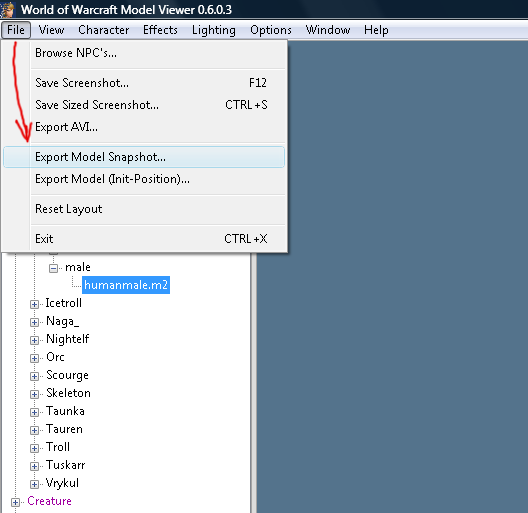 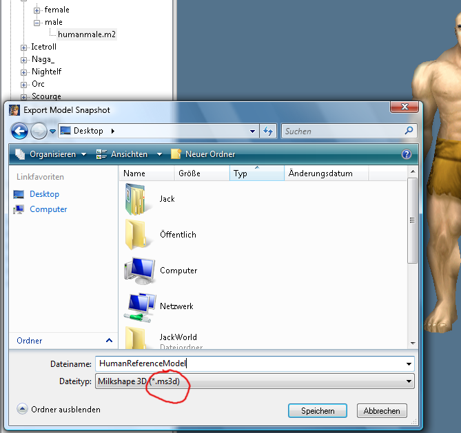 Model Viewer now exports the model with its UVs intact and the used texture files to your preferred location. Start up Milkshape 3D and open the newly created reference model. Go to "File -> Export -> Autodesk 3DS" in order to save the model as a file format 3ds Max can handle easily. 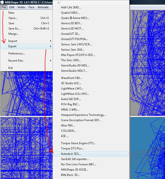 In 3ds Max you can now choose to import this reference model and using the scale tool you can size your item down to fit the reference model in size. 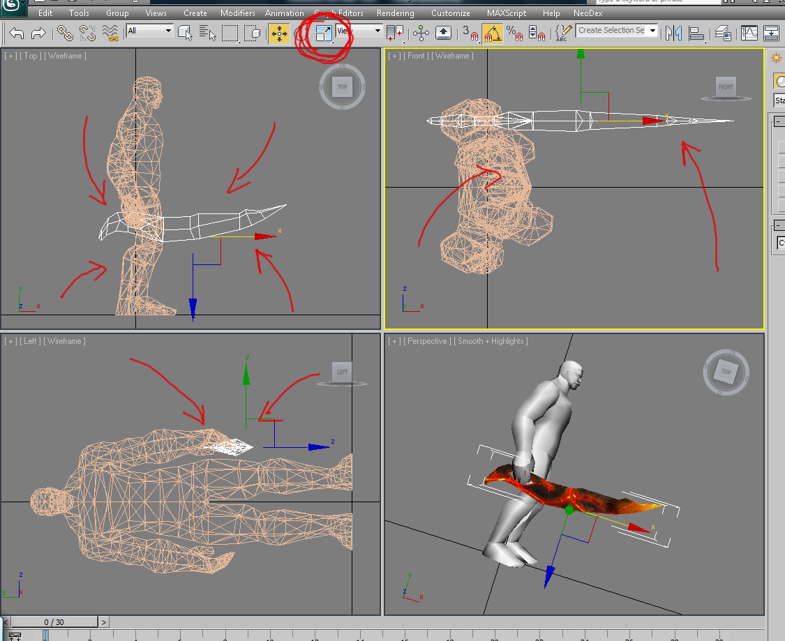 1.2. Correct Rotation 1.2. Correct Rotation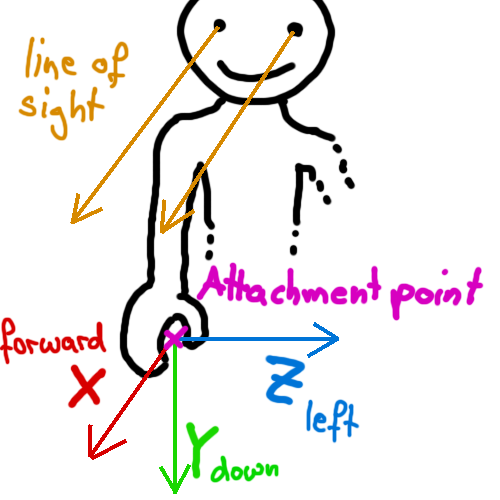 Using my RotationHelper.png it should be easy for you to rotate your model correctly. Something you shouldn't forget either is that the center of the document (where the fat black lines cross) is equal to the attachment point on the model, so make sure to line your item up right so it fits the model afterwards. 1.3. Export Option[/size] In order to be able to export the model right you need to transform all polygons to triangles (this will have no negative effect on your UV maps or textures, don't worry if you haven't done it up to now) The easiest way to convert all polys to tris is using the "Subdivide" Modifier. Apply it to your model and use an enormously big value as size. I use 100000 most of the time. 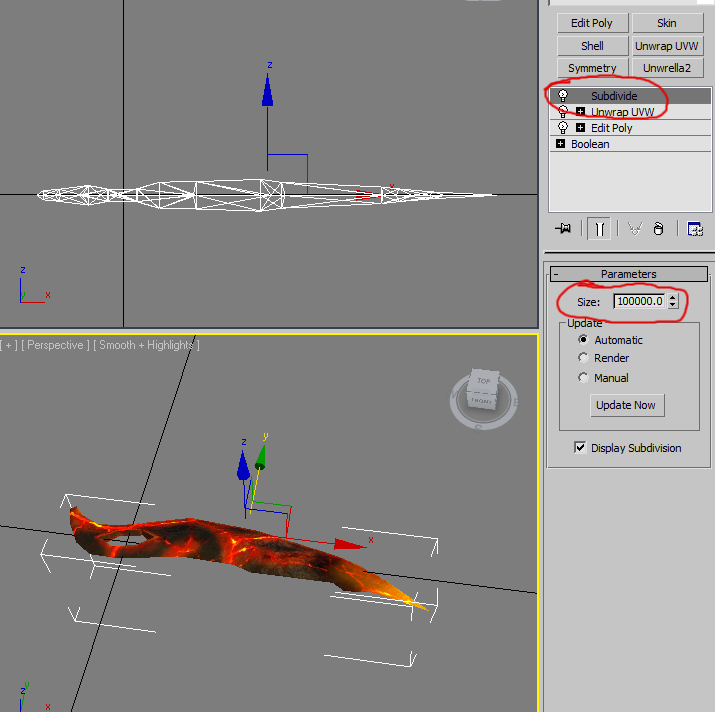 Once this is done and your desired item object is selected simply go to "File -> Export Selected" and save it as a .3DS file. In the upcoming window make sure to have the check on preserving the texture coordinates. 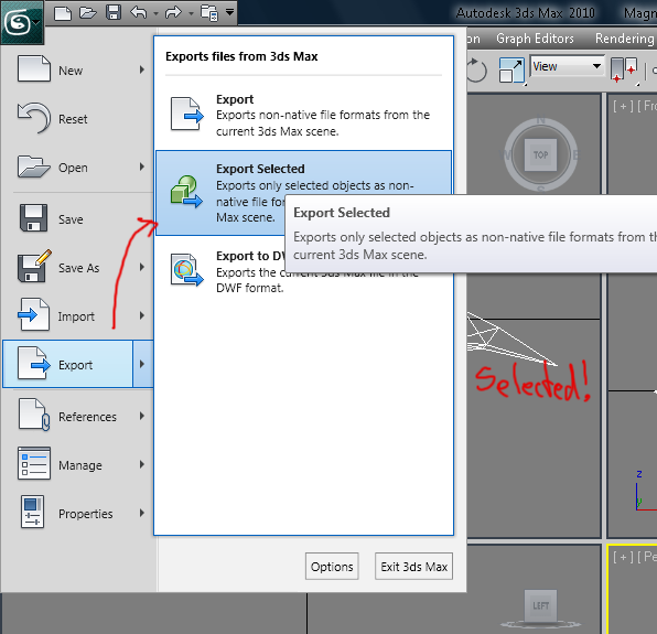
Pages: [1]
|